
The Creation Studio
Branding, Visual Identity, Market Research
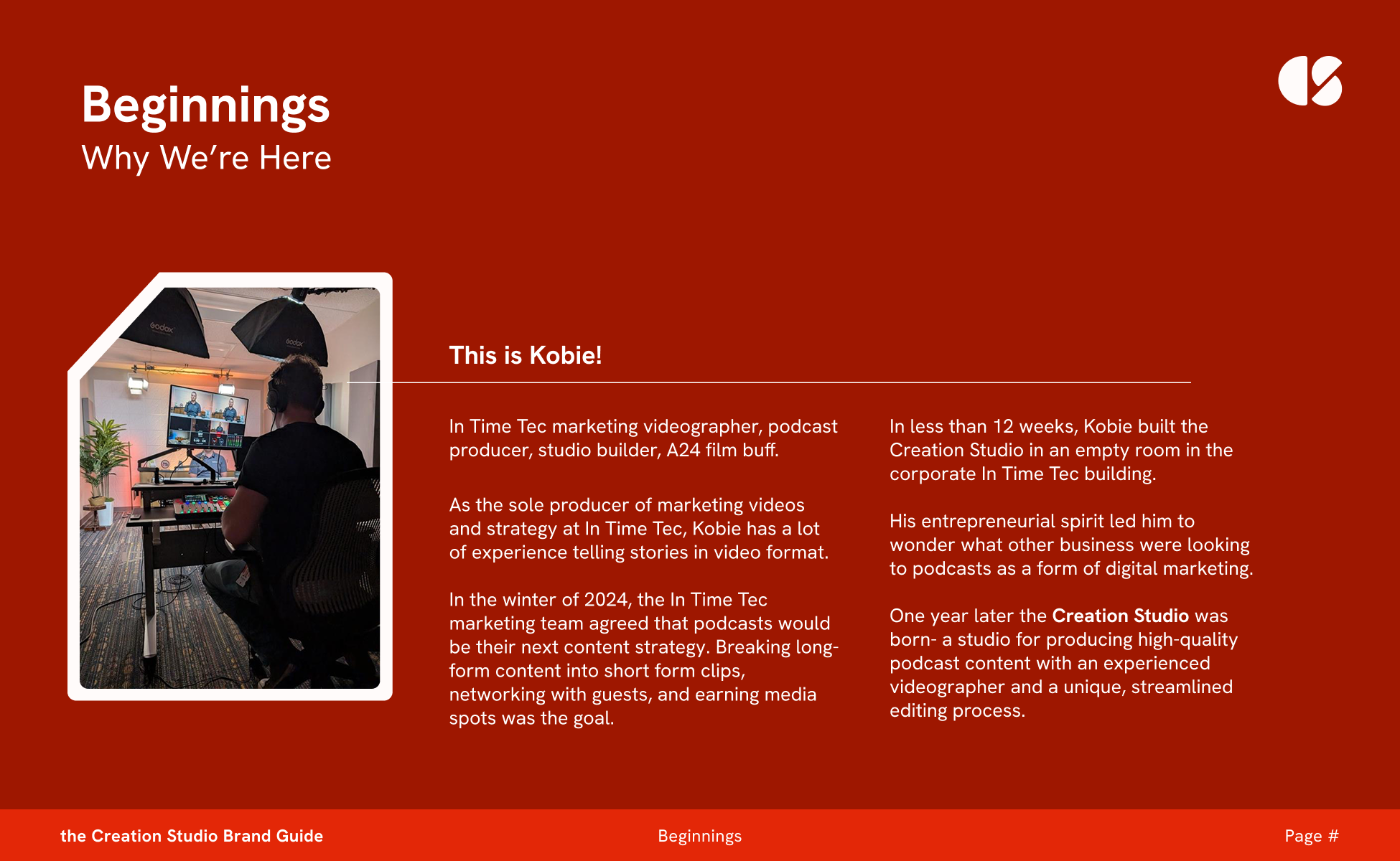
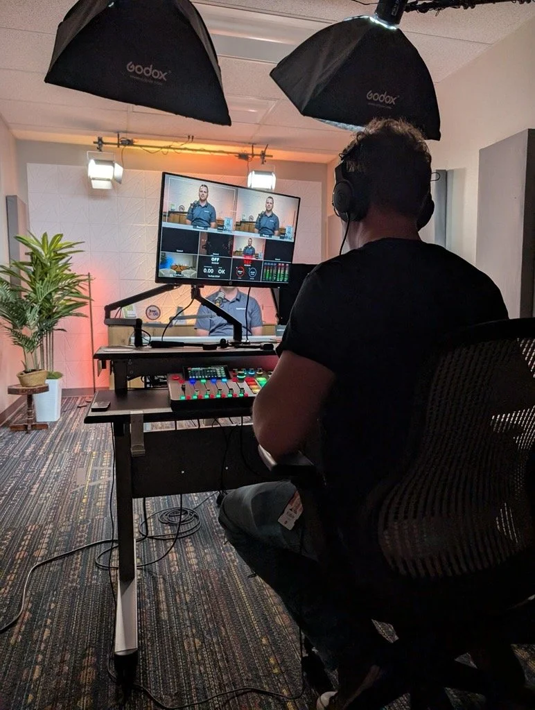
My good friend and coworker, Kobie, is an entrepreneur. His latest idea was to build a podcast studio for marketing efforts and sell the space to clients. Within 8 weeks of his idea, he had built a studio in our office building and was ready to develop his business plan. I came along with him to define his target audience and create a brand that would speak to his customer base while standing out in a lineup of other successful podcast studios in the Boise area.
The Brand Sprint and Research
First, I conducted a brand sprint with Kobie, which helped me understand his needs, what he wanted to see from the logo, and the attributes and characteristics I could turn into a brand.
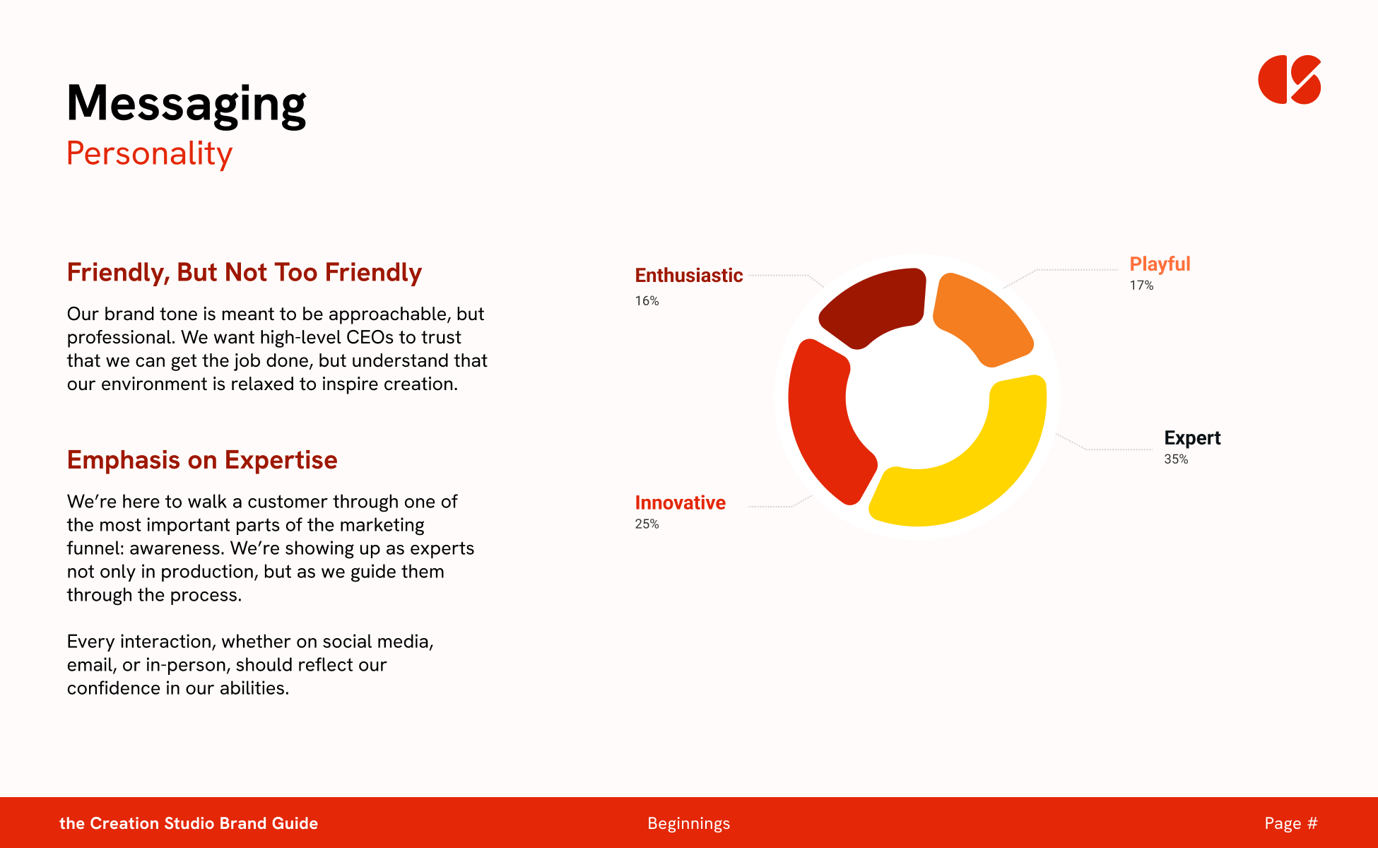
The Creation Studio was innovative, but not out of reach. Personable, playful, open, and professional. A blank canvas for creators to be able to step into a space and create their own product. Experimental, authentic, enthusiastic, welcoming.
Logo Concepts
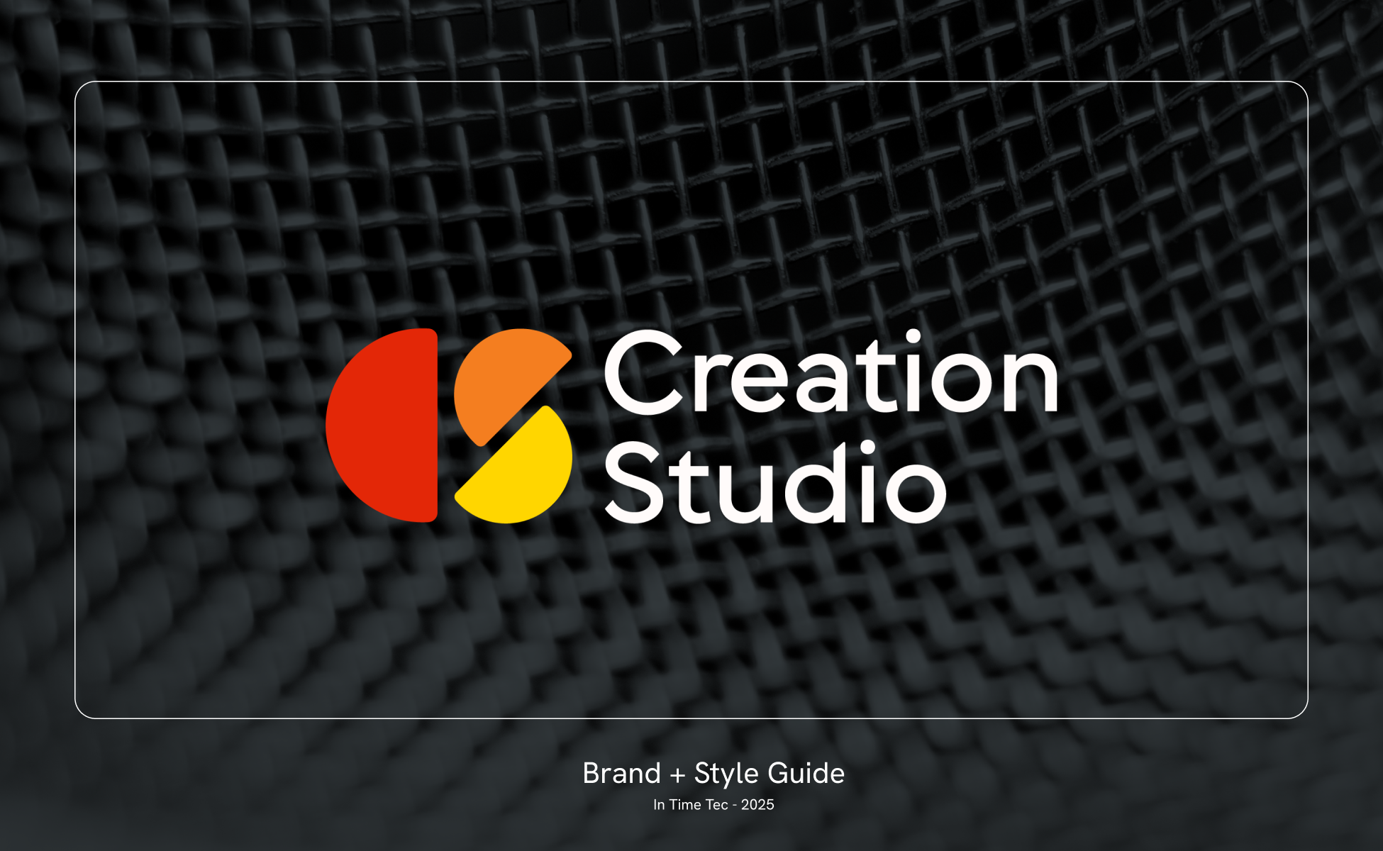
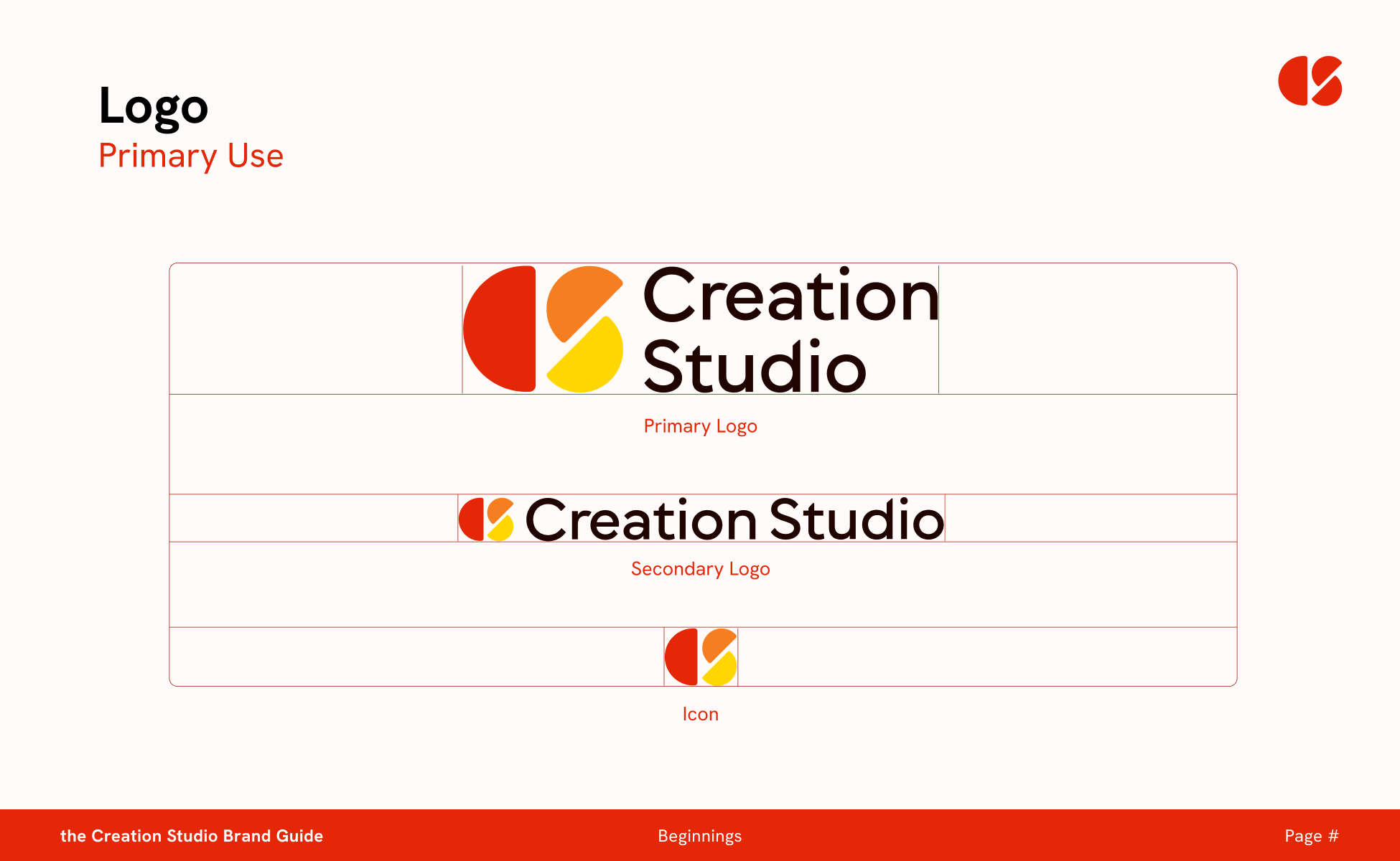
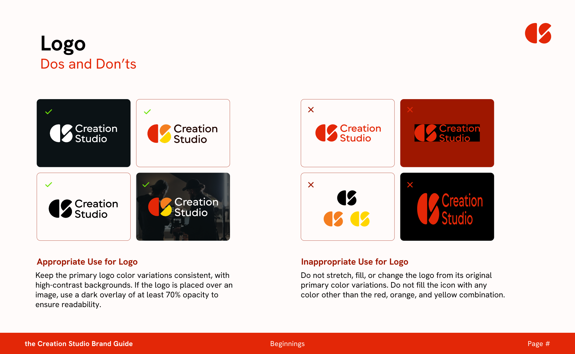
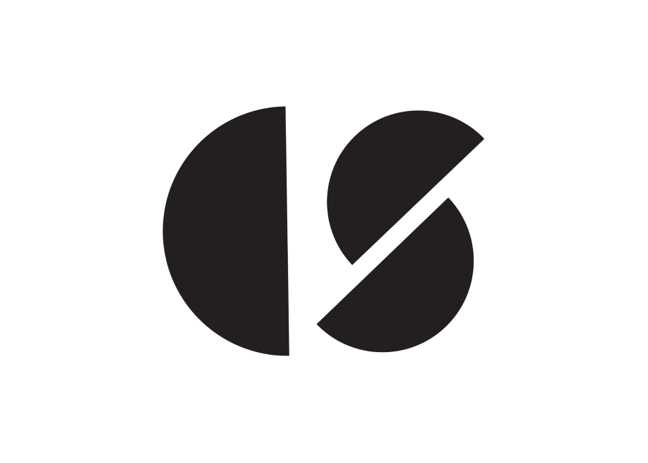
Through iterative processes of drafting the logo, I landed on an abstract representation of the C and the S in the name Creation Studio. It felt balanced, open, and invited the viewer to imagine themselves as a blank canvas.
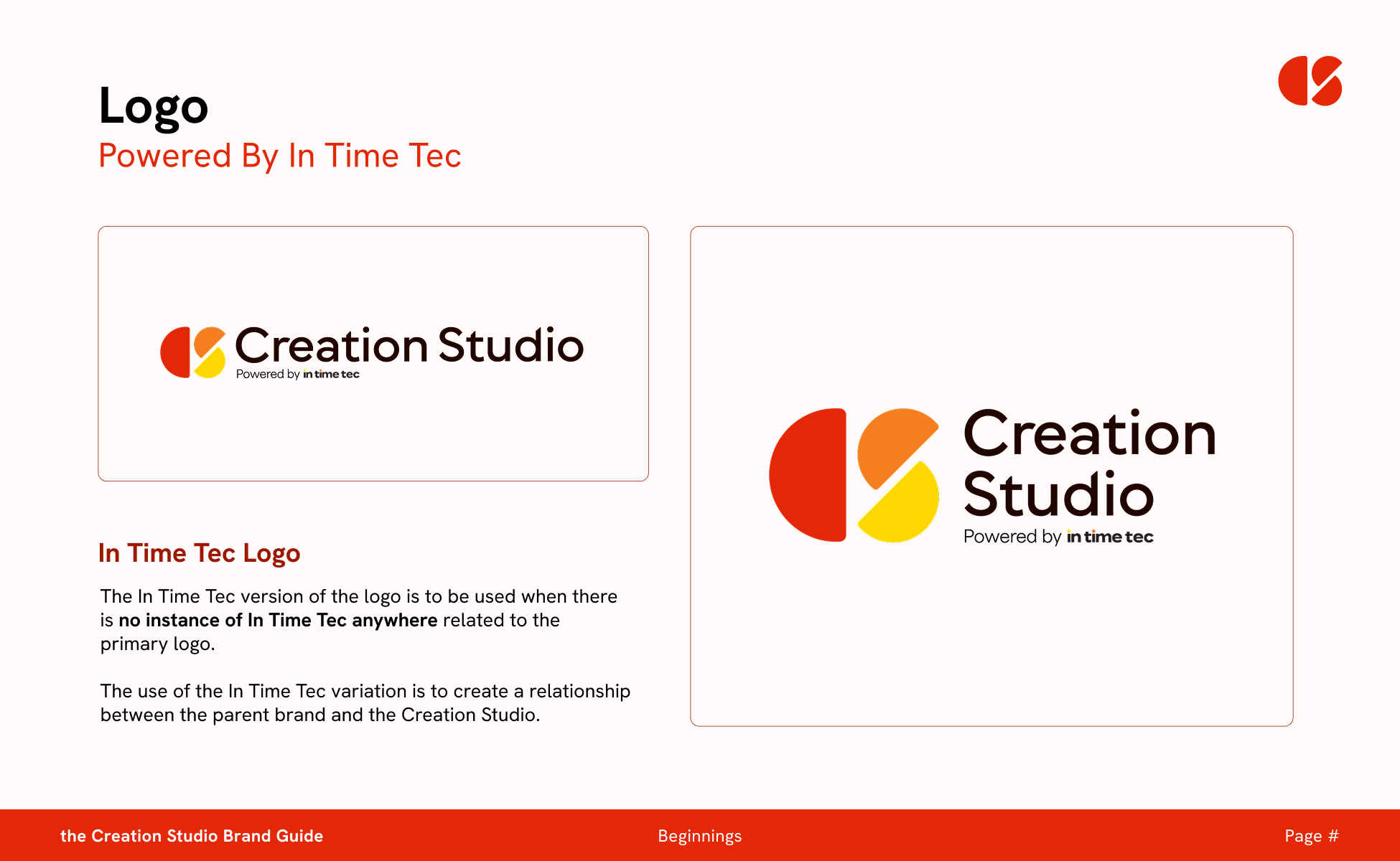
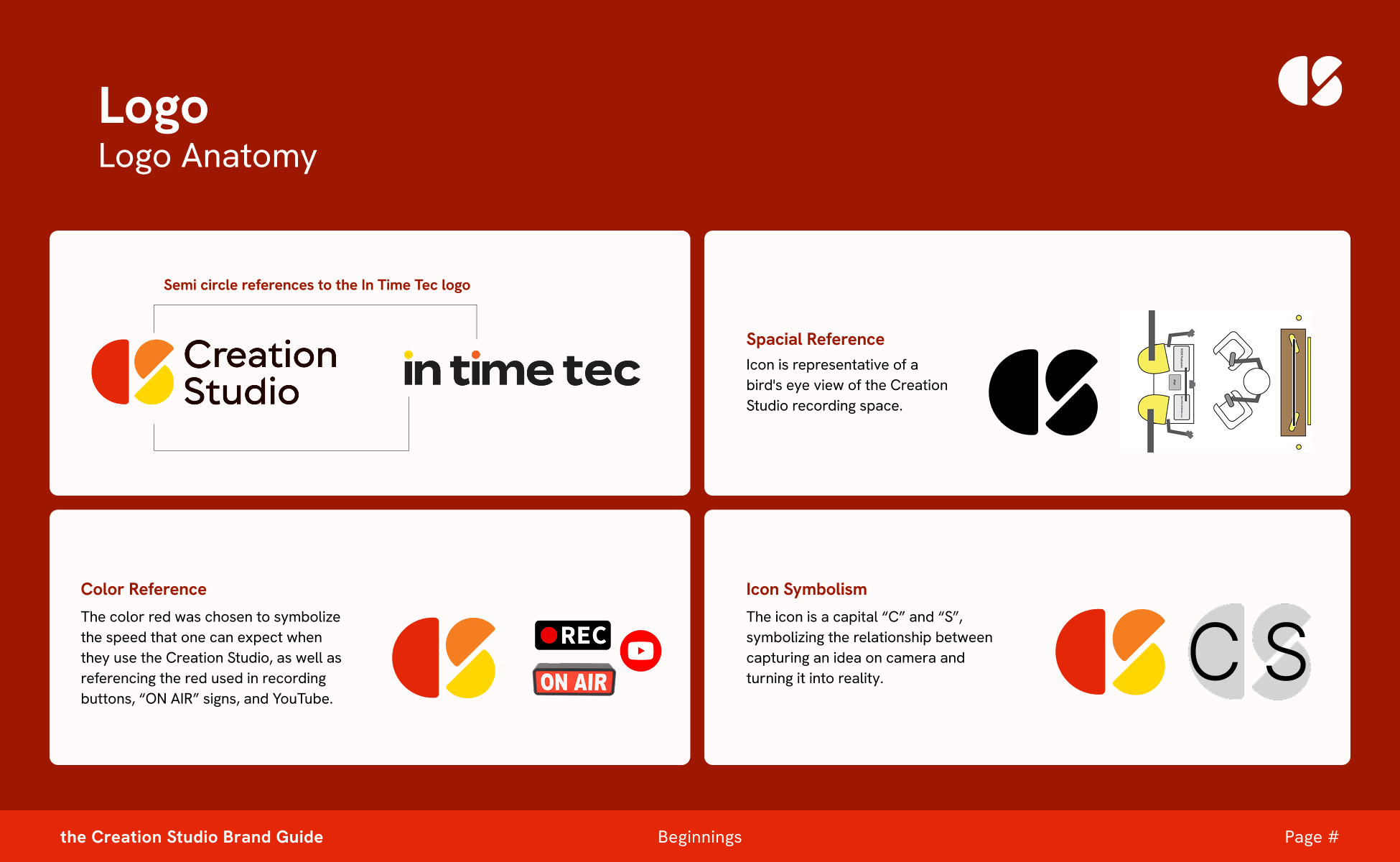
The semi circle references held a lot of meaning for the Creatio Studio. It paired well with the In Time Tec logo, while also nodding to the physical space of the Creation Studio itself.
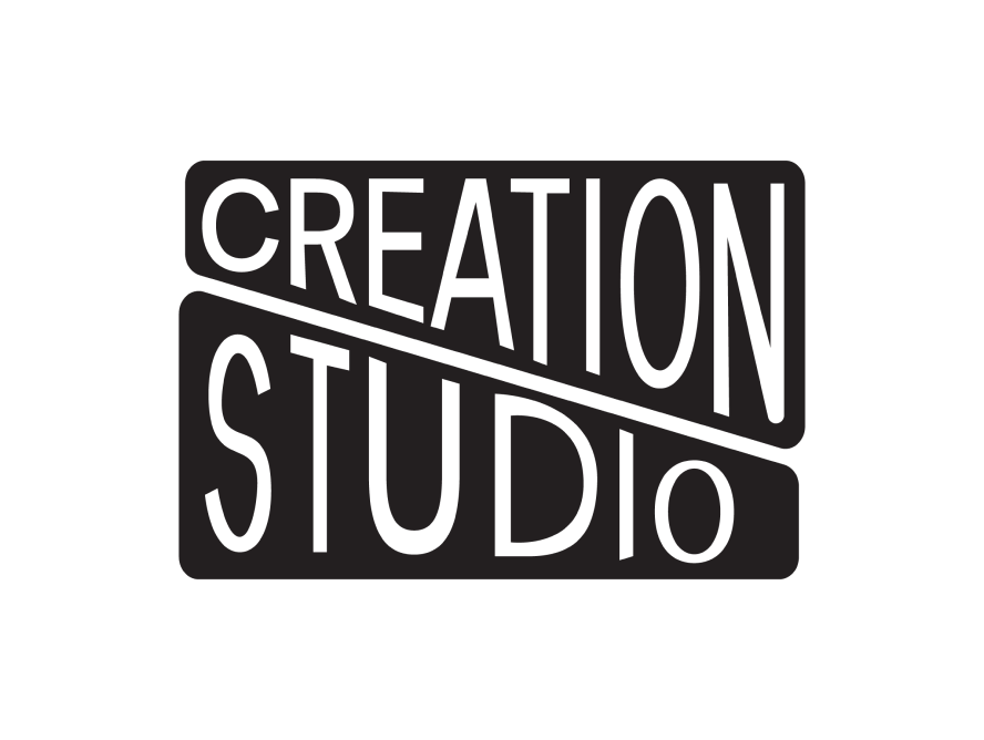
Honorable Mentions included. The reasoning behind not choosing these logos centered around the need for the Creation Studio to maintain professionalism while also being expressive.


The Process
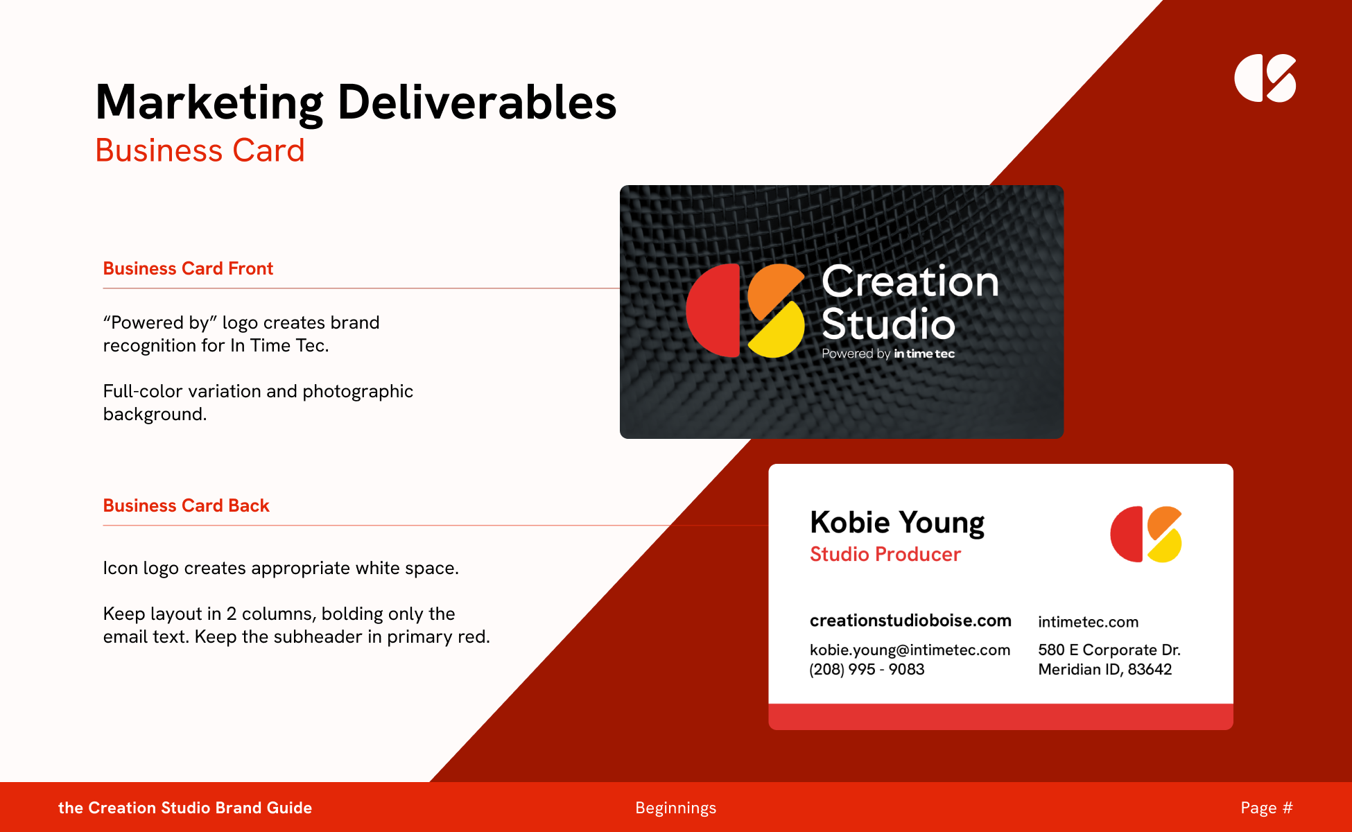
The Creation Studio needed its own identity; however, it was powered by its parent company, In Time Tec, and needed a word mark with a similar tone and feeling. The idea was to create a wordmark that references the In Time Tec logo and keeps a similar feel to the parent brand while maintaining its own standing.
I knew this was going to be an interesting challenge for this project, as the In Time Tec brand was not targeting the demographic I knew Creation Studio would be.
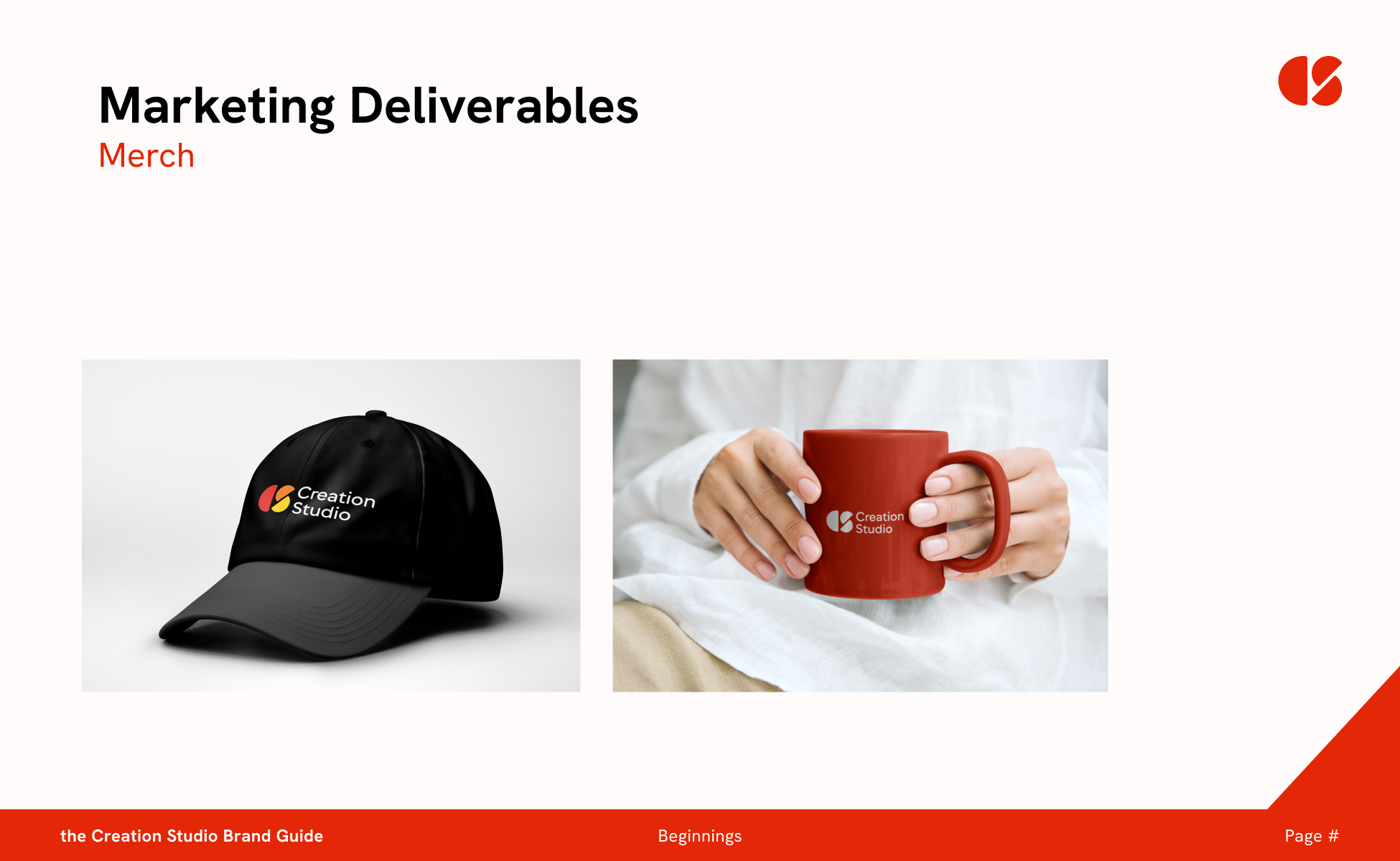
Along with a logo, a built-out visual and brand identity would be needed for creating a new marketing strategy.
The Creation Studio, 2025
Final Logo + Brand Direction
Through iterative processes of drafting the logo, I landed on an abstract representation of the C and the S in the name Creation Studio. It felt balanced, open, and invited the viewer to imagine themselves as a blank canvas.
The semi circle references held a lot of meaning for the Creatio Studio. It paired well with the In Time Tec logo, while also nodding to the physical space of the Creation Studio itself.