
ForecastScope
Branding, Visual Identity, Market Research, UX Design
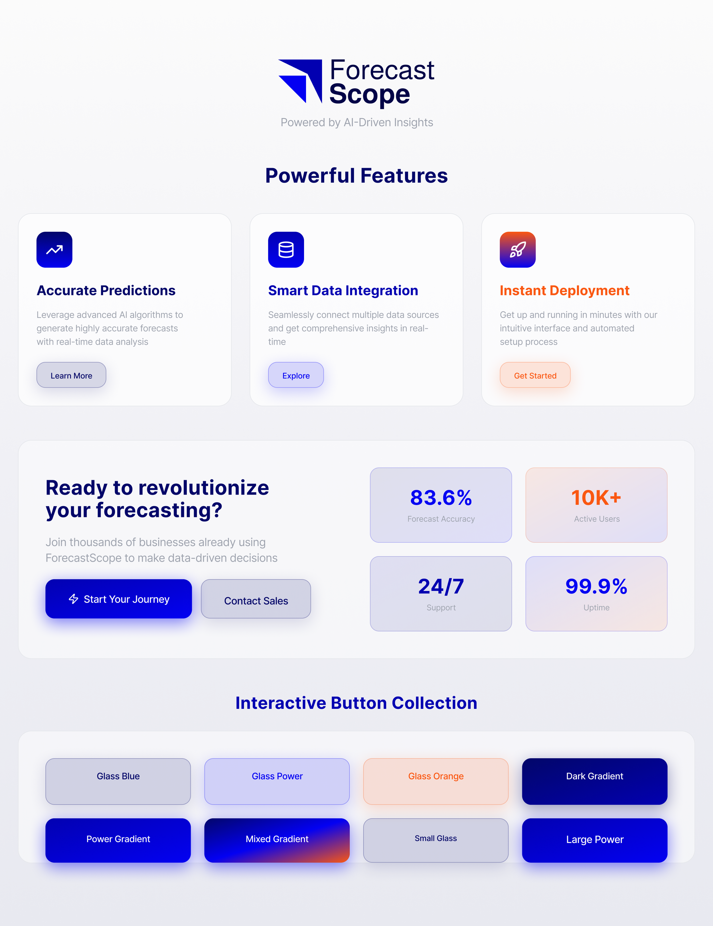
The company I work for was developing a mobile app for manufacturing companies. The app is used to predict trends from large amounts of data and display the results on a clean, easily readable interface. The app was our launch into predictive analysis, using AI as a tool to increase trust and grow business revenue.
I was asked to design a logo, and come up with a visual identity that not only complemented the user interface, but adapted to the needs of the mobile app itself. Considering UX design played a huge part in the research and development of the brand, and was an integral part of the process.
-
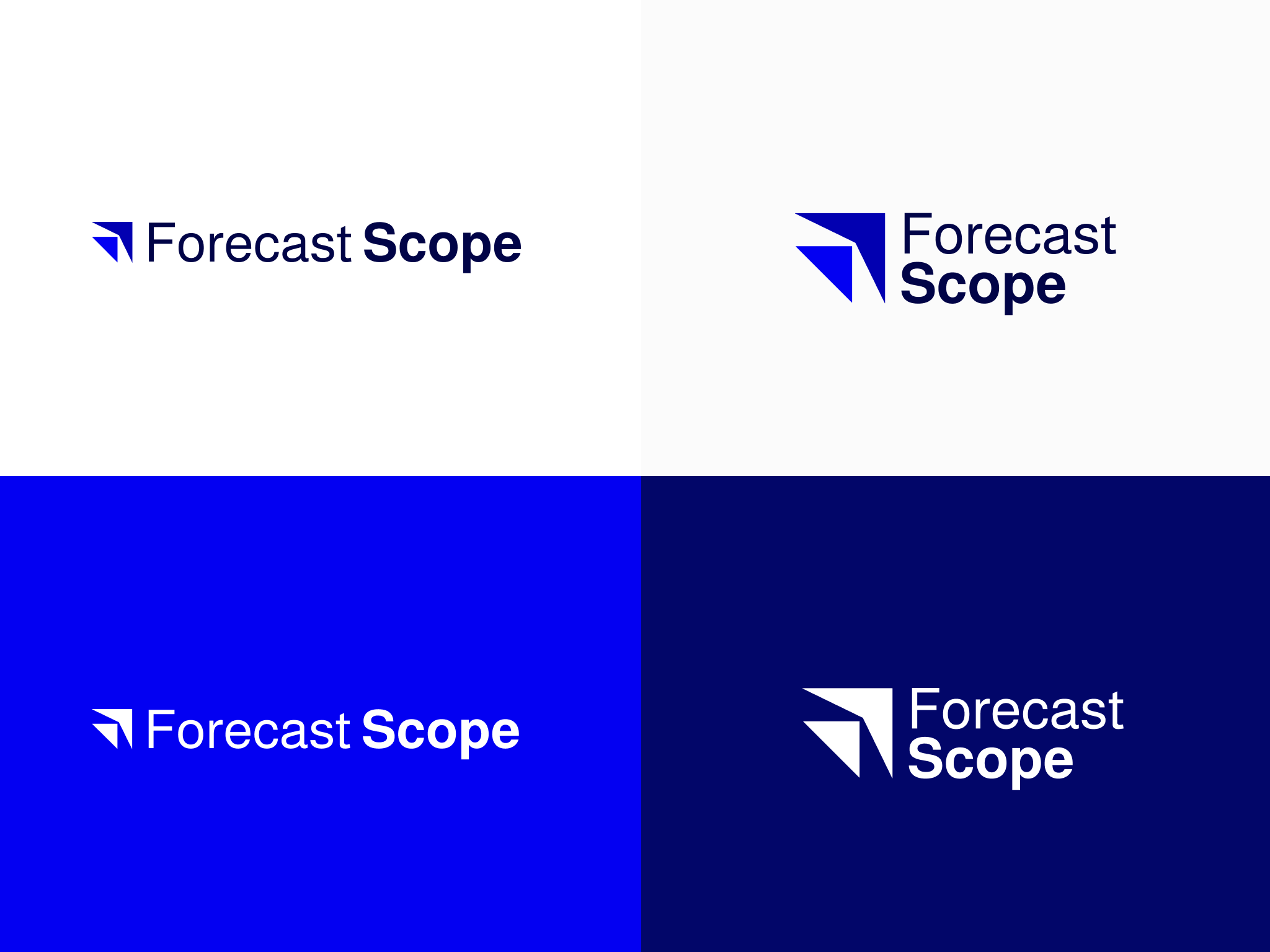
![]()
Adaptable Logo Package
-
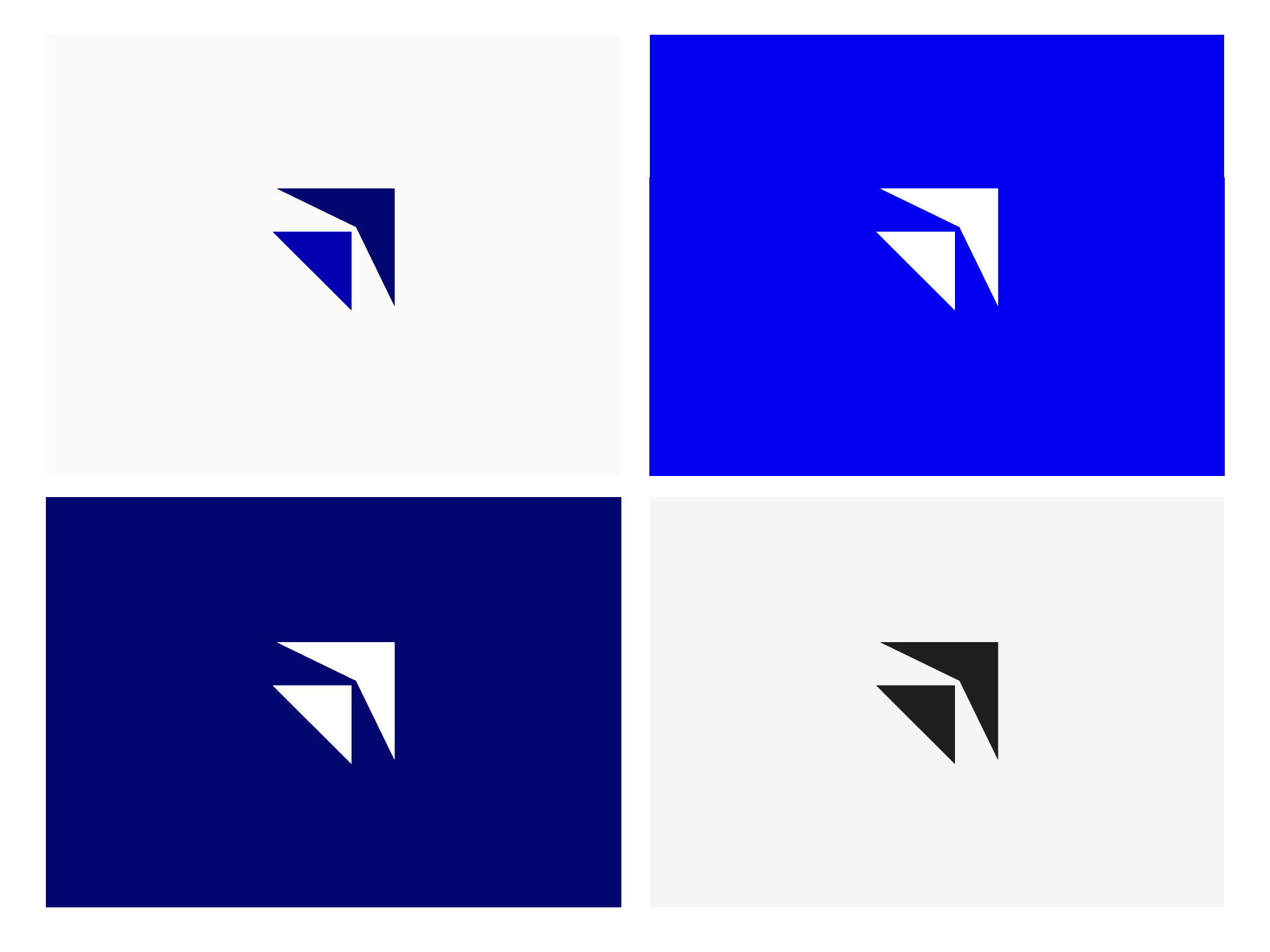
![]()
Icon Sizes
-
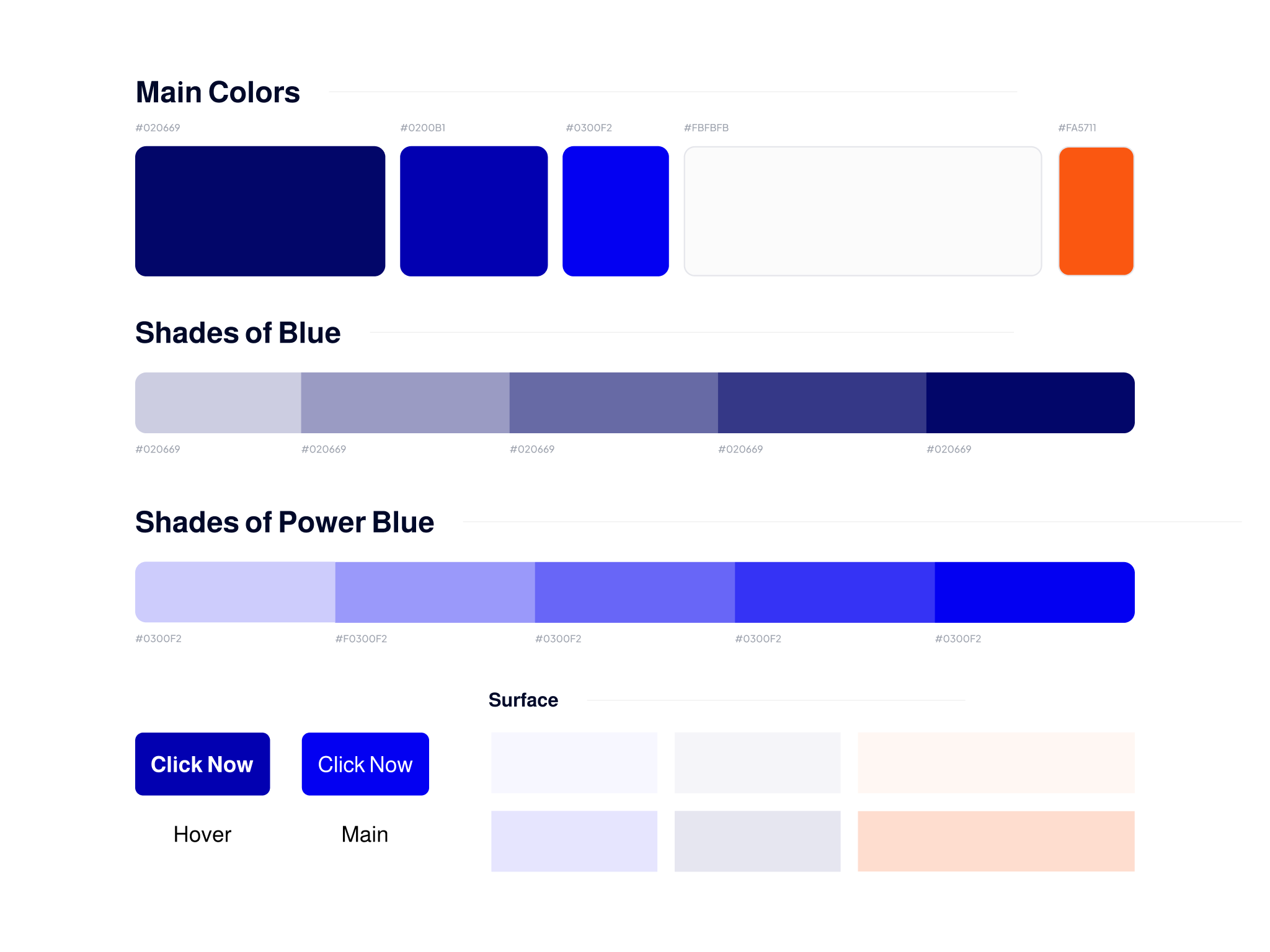
![]()
Brand Colors
-
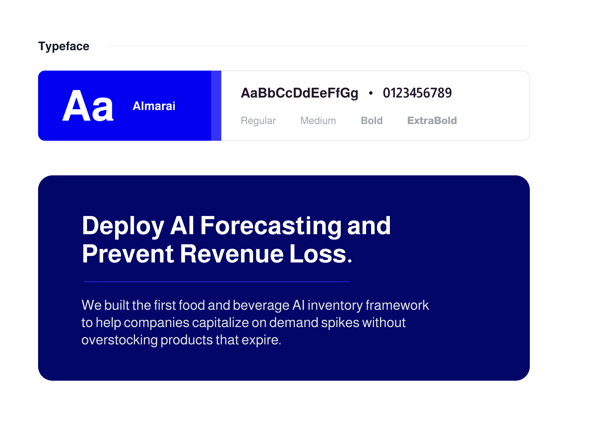
![]()
Brand Typefaces
The Research Process
I started by attending the development meetings and understanding the purpose and the impact that the app was going to have on its users. It is crucial to understand how an app works before you design for its user interface.
Functions, accessibility, and the places where color and hierarchy guide the user all play a part in designing the application itself.
I then conducted market research to identify companies and brands currently in the predictive analytics space that could be considered our competitors.
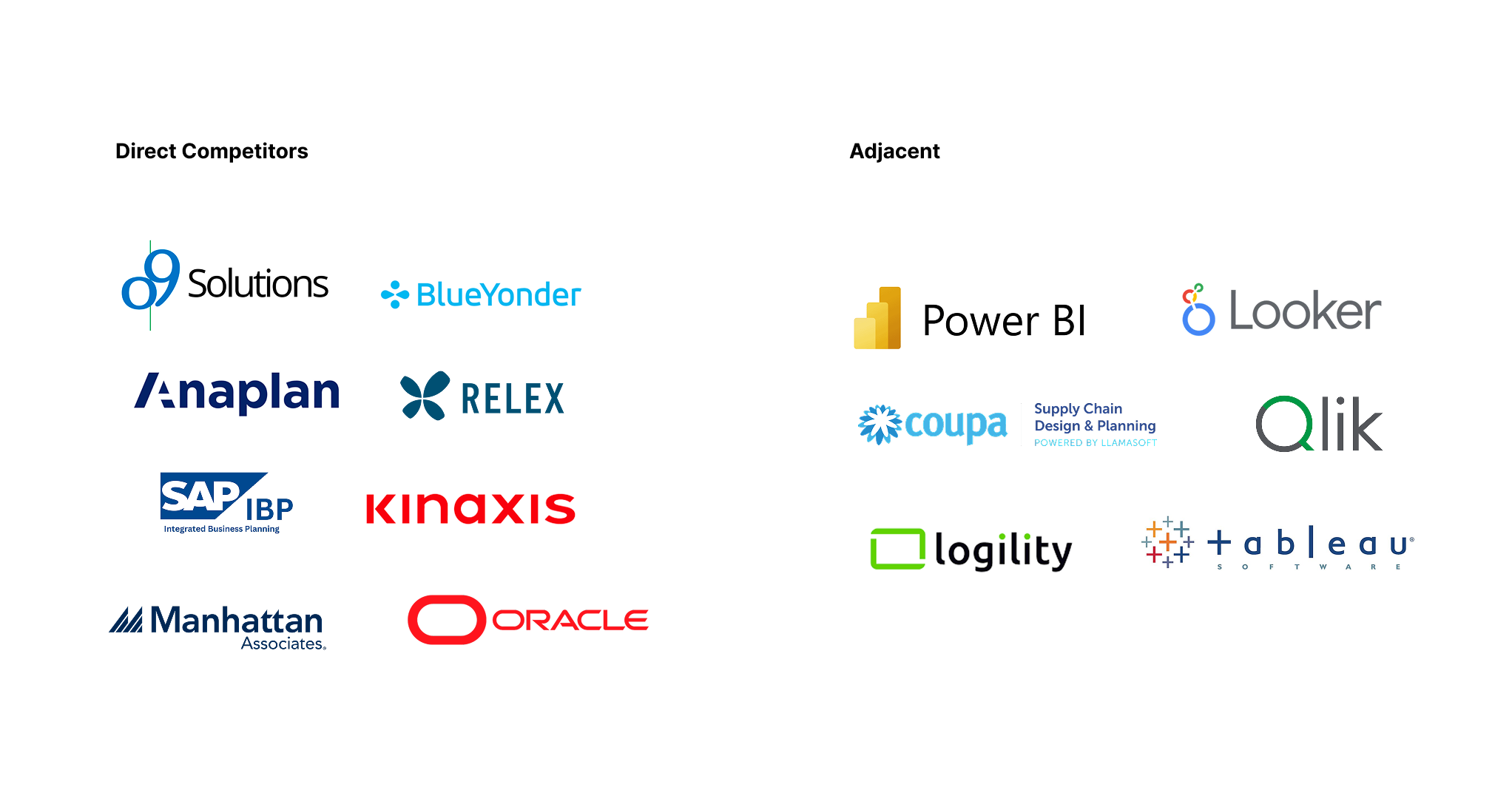
Market Segmentation
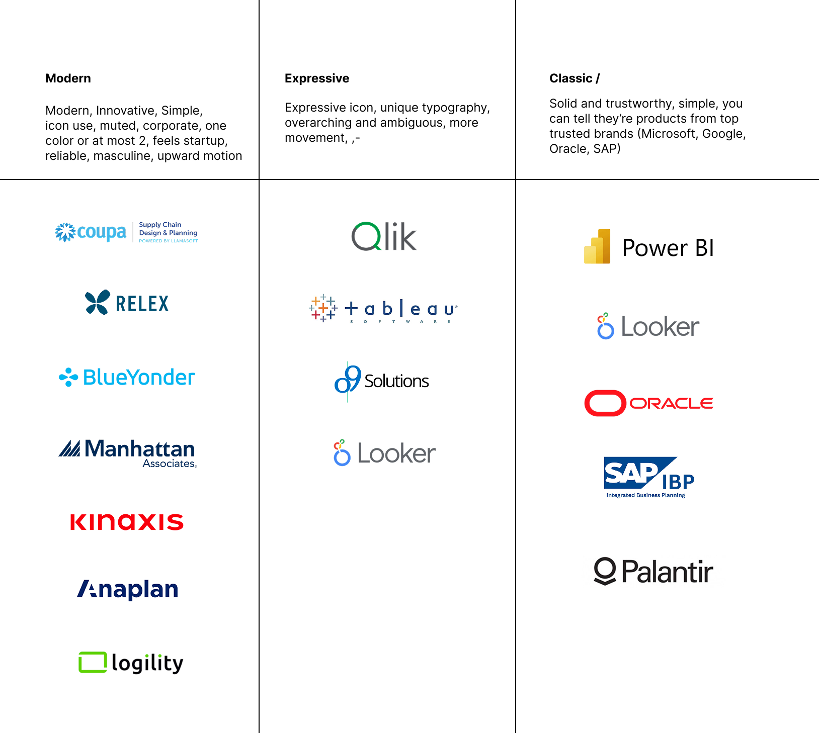
I then organized the brands into sections so that I could identify what makes them different, similar, and identify common patterns.
They all seemed to follow a similar structure, using iconography paired with a bold, structured typeface.
Some of the logos felt more modern at first glance, some felt more bold. I noticed that there was a similarity in a few that I wanted to replicate.
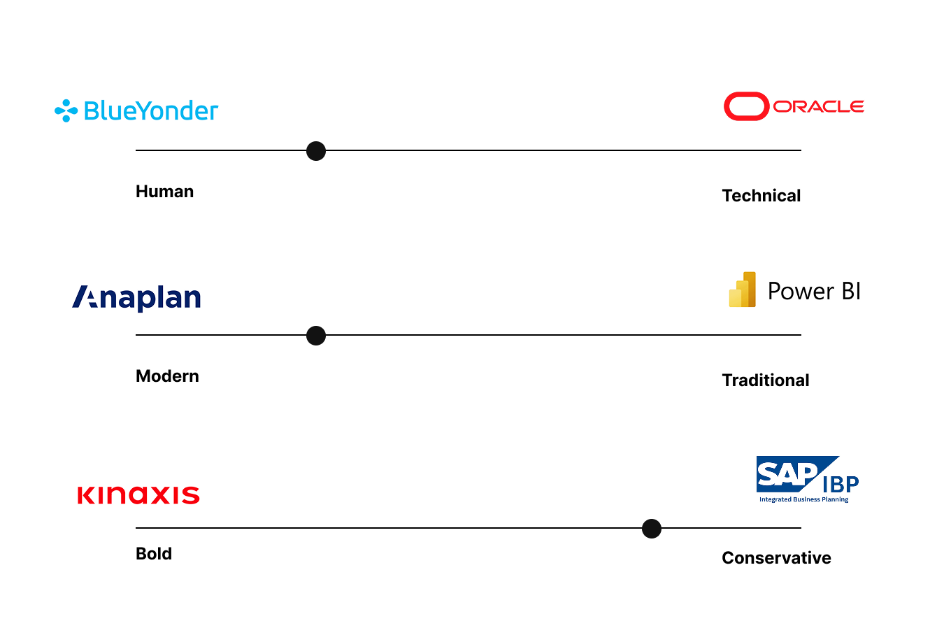
Personality Sliders
After working closely with the developers, UX designers, and product owners, I determined the personality of the brand based on the feeling that I wanted to users to associate it with.
By identifying where the brand would sit compared to other direct companies and logos, I was able to narrow down a direction seamlessly, while keeping the focus direct.
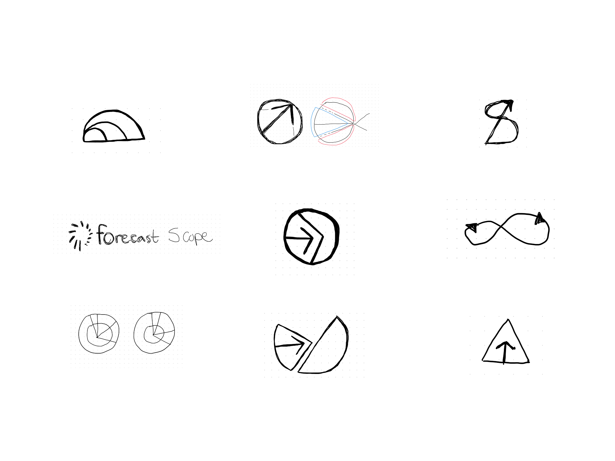
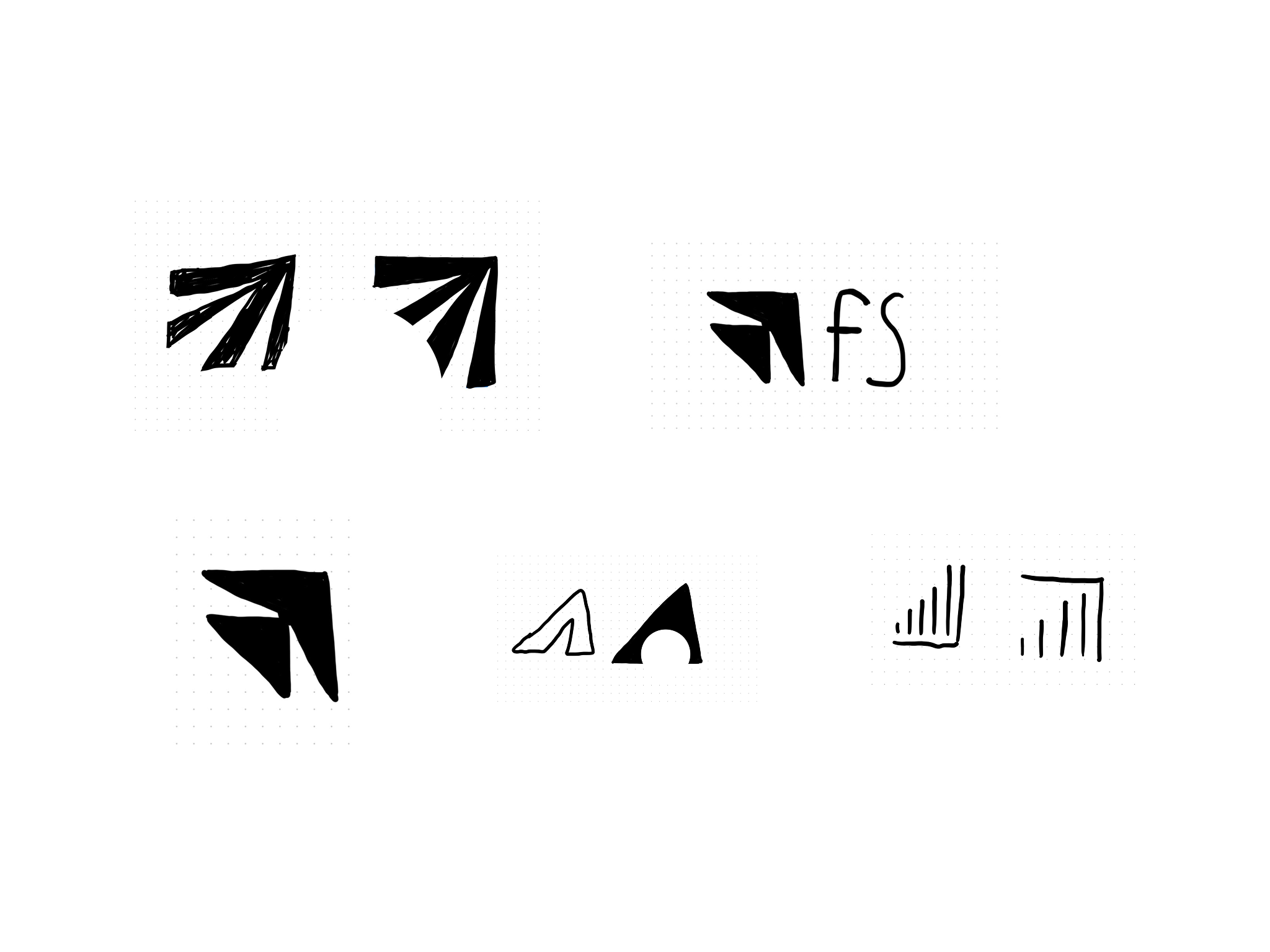
Logo Concepts
I wanted to emphasize the data visualization of the app itself within the logo, and indicate that there was a feedback loop of information from the user uploading data, and the app learning trends to show the user.
The first logo drafts were representative of the “scope” as well as a graph showing progress, a delta arrow to indicate change and variance, and an evolution of shapes and their spatial relationships.
It was important to me that the logo didn’t feel too feminine, which is why I decided to focus more on the upward motion of the logo on the second round of sketches.
I landed on the movement of revenue rising upward, paired with a delta indicating the change in data, as a final logo concept.
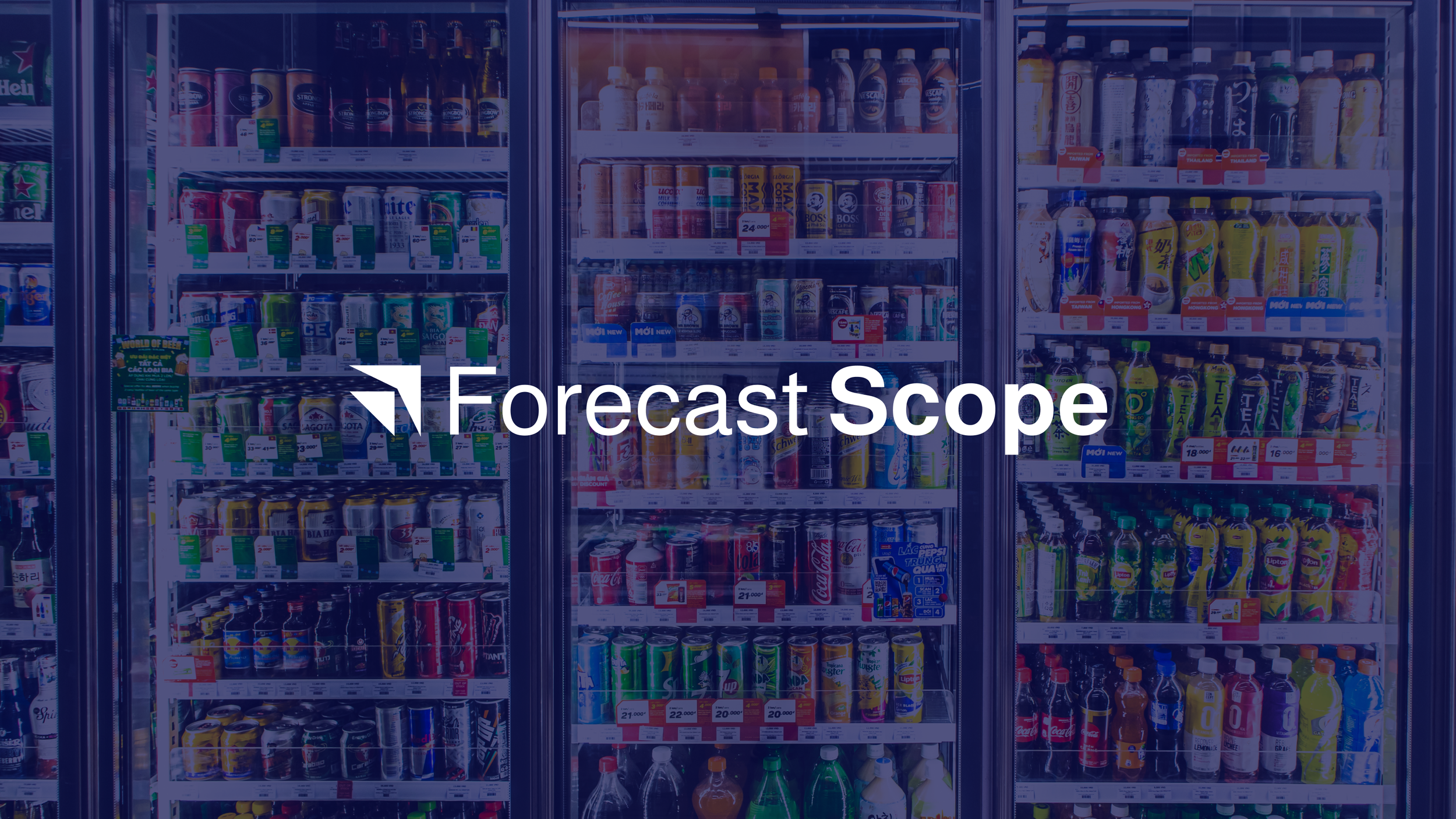
Visual Identity In Use
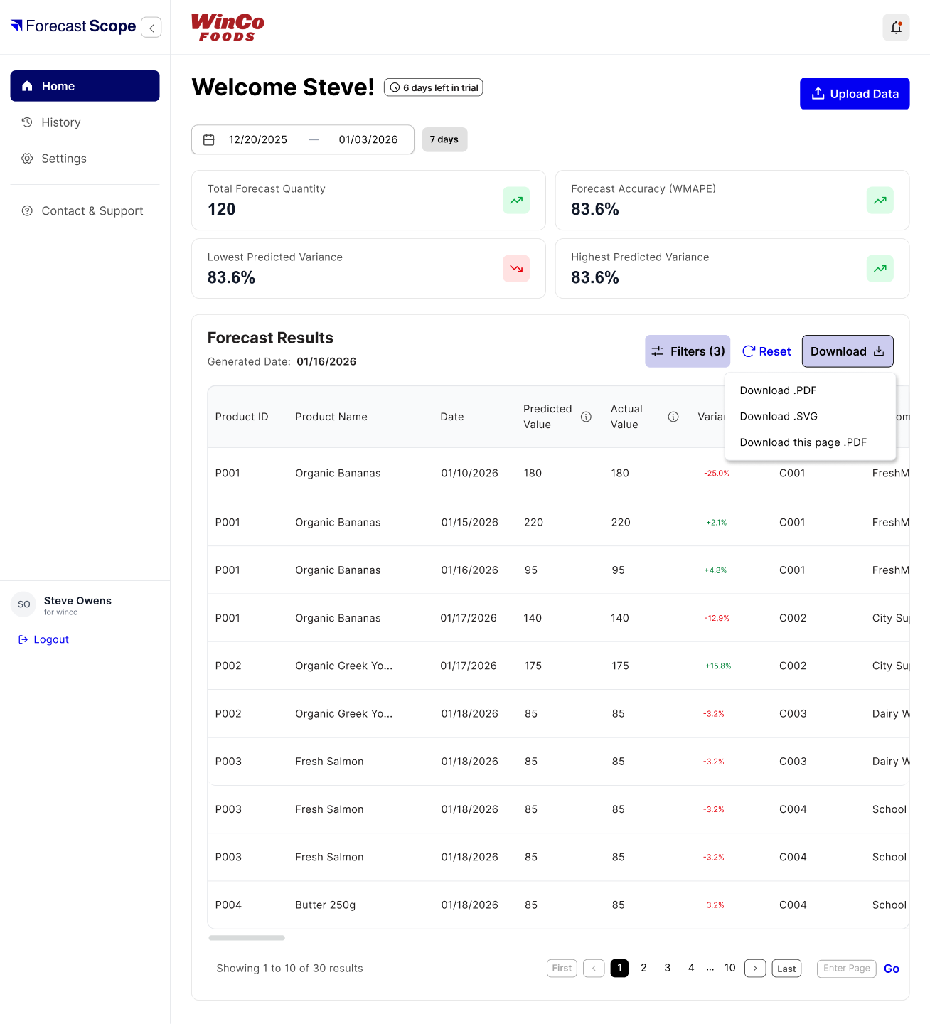
Once the visual identity was developed and had gone through several rounds of review, I handed the style guide off to the UX team to implement it into the mobile interface.
The colors were tested for web and mobile accessibility, as well as the typeface integrated into the design system in Figma.
Each touchpoint of the visual identity was integrated seamlessly into the mobile app, with the help of our amazing UX designers. The blue stood out against the white, yet gave a solid, trustworthy feel that was hard to mistake.
Adaptable to All
The best part of the identity is how flexible it was to whoever it was designing the interface with.
The identity was created in Figma, so the colors, typeface, and vector logo itself were all scaled for web design, and were easily accessible to build a thorough design system that was scalable.
-
I used Figma and Adobe Illustrator to design the logo and visual identity. Adobe Illustrator was used to refine and scale the logo, while Figma was used to test colors, typeface, and placement.
-
I tested accessibility of colors in the whole process, using Figma plugins to ensure colors were toned to protect readability of text.
-
This project was end-to-end, 2 weeks long, the first week being dedicated to market research, and the second focusing on visual identity creation.