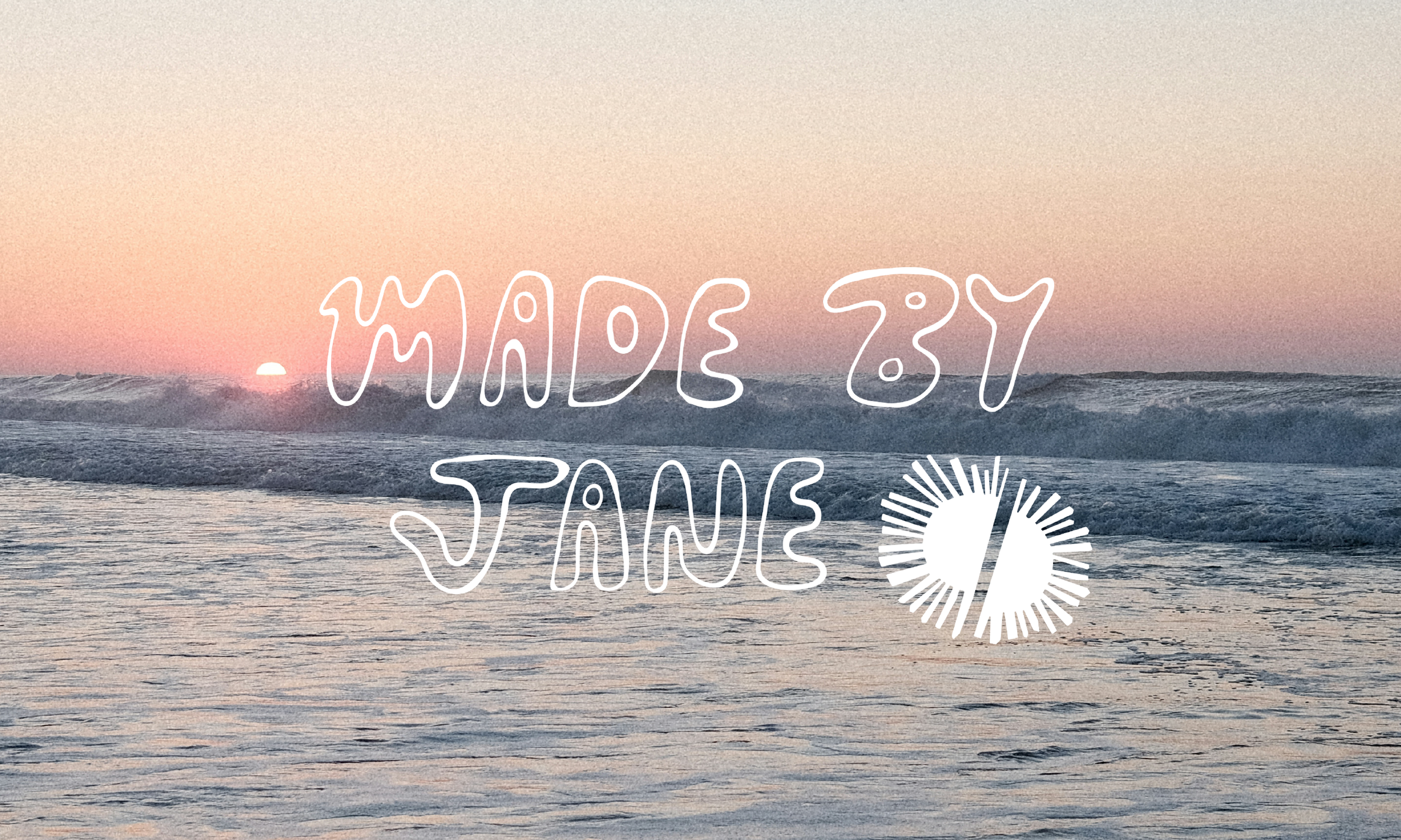
Made By Jane
Small Business Branding + Custom Logo
In the sunny islands of Hawaii, one of my good friends Jane started a crochet business. Her focus? Turning balls of soft, colorful yarn into bikinis, tank tops, and beach coverups. Light enough to feel the sun’s rays, and as unique as a shell on the sand, her hand-crafted goods quickly became a passion project turned business endeavor.
How to Brand a Crochet Company
What Jane needed was a handcrafted, personal, and stylish brand as unique and interesting as her crochet patterns. Her goals for creative branding was to have something recognizable, a scalable and unique word mark that could be printed on tags, embroidered on labels, and printed on business cards.
For Jane, being able to compete with larger-name brands while maintaining her local status was the most important. Secondly, her desire to keep that hand-made, messy, stretchy, adaptive look to her brand was necessary to her authentic approach to crafting.

@madebyjanek on Instagram
My Approach
I took her vision to heart, and used social media research, market research, and human-centered design approach to create a responsive, hand-drawn word mark and brand to create a cohesive look that turned her passion project into reality.
I used a feedback-based cycle of iterations, with regular meetings to review the drafts.
-
I used Adobe Illustrator, Figma, Photoshop, and Google Drive to complete this project.
-
I approach every logo creation the same— by sitting down with the client and creating a mood board with them.
This creates a space where the client is able to express their style, and for me to gather insights and inspiration before I start the ideation phase

A research-crafted mood board based on Jane’s brand personality
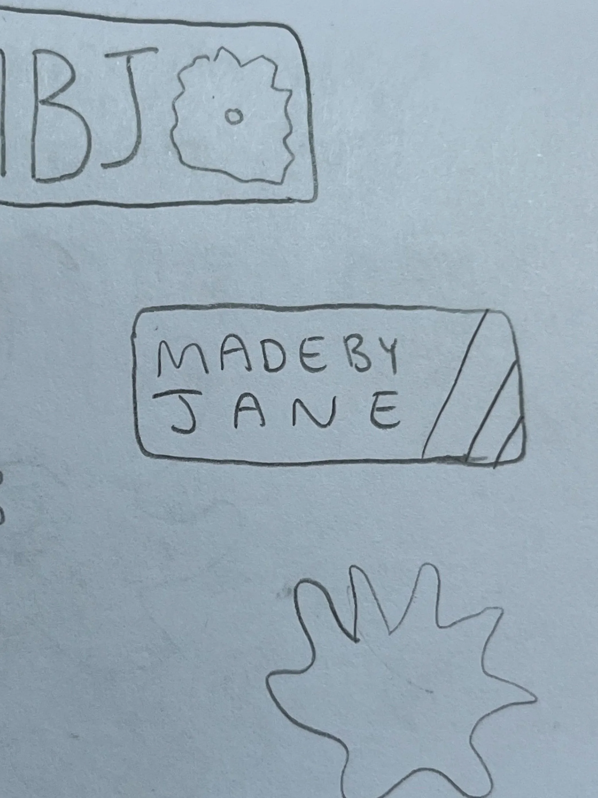
I started by sketching logos that captured the name of her brand, and ideating different ways it interacted with shapes and marks.
Overall, a logo that represented a stamp was something the client was looking for. Her goal was to have a responsive logo that could easily be recreated using any medium.
Clothing tags, business cards, printed on packaging, and marketing needs were all places that I knew the logo was going to exist.
Logo Ideation


Hand-drawn vs Digital
Made by Jane offers hand-crafted goods from a local business owner on the sunny beaches. A hand-drawn logo fit the identity of the brand, and created a unique, interesting contrast next to similar brands that utilized a luxury approach.
Color
Colors that would look just as good on an Instagram feed as they would printed on a label were my main focus.

Colors can not only be a brand asset for materials, but can also help strengthen the brand’s identity. Using colors associated with specific feelings helped me create a strong visual identity that stayed true to the brand’s core attributes.
Color Pyschology
Coconut Creme
Warmth, Curiosity
Kumquat
Joy, Enthusiasm
Waterfall
Confidence, Harmony
Pool Noodle
Purpose, Loyalty
Hibiscus
Feminity, Creativity

There was no shortage of inspiration to drive the color selection. Made By Jane is a company that is driven by finding beauty in the bright, bold and unconventional. Her brand was made to stand out, on the beach and digitally.


